Earlier this week, Gmail rolled out new buttons to the site. As I understand it, these buttons are meant to make the UI more consistent across browsers, and make the experience more streamlined.
 These buttons have a gradient background, making them appear rounded, and they are grouped together in “pills”, to keep related actions together. The buttons on the ends of the pills have slightly rounded corners. The cool thing about these rounded corners is that they are pure HTML/CSS (they don’t use any images) and they work in all browsers (unlike the firefox-specific -mox-border-radius directive). The drawback is that you can only get slight rounding; no a gradual curve. Also, the markup is far from simple.
I thought they looked pretty sweet, so I got to wondering how difficult it would be to try them myself. Douglas Bowman, from Google, wrote a post about how these new buttons evolved. He didn’t come out and say how they were done int he final result, but he did invite people to reverse-engineer the new buttons. I decided to take him up on that invitation.
[ad]
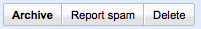
So, my solution is very similar to Gmail’s, but not exact. It uses the same method of creating the gradient and the rounded corners, which are the most complex parts of the whole thing. I made it easy to mark which button is the primary action, and have the appearance of the buttons change depending on whether the mouse is hovering over or clicking on the buttons. For example, in the following screenshot:
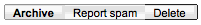
- The ‘Archive’ button is marked as the primary action.
- The ‘Report spam’ button is shown as it would if it were being clicked.
- The ‘Delete’ button looks as if the mouse were currently hovering over it.
The HTML markup looks like this:
<span class="pk-button">
  <span class="outer-box">
    <span class="inner-box">
      <span class="pos">
        <span class="top-shadow"></span>
        <span class="content">I am by Myself</span>
      </span>
    </span>
  </span>
</span>
The class ‘pk-button’ just sets this apart in the CSS. You can easily change that if you like. To mark the button as either a primary action, being hovered, or being clicked, just add the ‘primary’, ‘hover’, or ‘click’ class names to the outer-most span. You can (and will probably have to) add the ‘click’ and ‘hover’ classes with javascript, since the psuedo-classes ‘:hover’ and ‘:active’ don’t work for tags other than <a> in Internet Explorer.
To group the buttons into “pills”, add the class name ‘collapse-right’ to the button on the left side of the pill (the one with its right border collapsed), and ‘collapse-left’ to the button on the right side of the pill. Add both of these classes to buttons in the middle of the pill (with both sides collapsed).
The CSS is pretty lengthy, so I won’t paste it in here, but you can check it out on my demo page.
Let me know what you think, and if you can think of ways to make it better!
2 Comments